Tuesday, 20 March 2012

In what ways does your media product use, develop or challenge forms and conventions of real media products?

In what ways does your media product use, develop or challenge forms and conventions of real media products?

As a way of identifying how successful my magazine is regarding codes and conventions, I've analysed a cover from a magazine of a similar genre, Q magazine and compared it to my own front cover to determine the likeness between them both. In order to identify the codes and conventions, I've labelled them and added a description of why they are used and the effect that it had on the audience.
When designing my magazine I took into account the different conventions used in actual magazines to create realism throughout the product. To do this, I included stereotypical codes and conventions of a music magazine including; a masthead, luring techniques, bar codes/price/issue number and an interesting and engaging cover shot. Also in the Contents and double page spread pages, I used typical magazine conventions such as using columns within the text to give the magazine an authentic feel to it.  As well as using a traditional Heading within the article, an enlarged quote from the artist was used as this is often the case within real magazines and i wanted to replicate their success.
On the double page spread, I also included the slogan from my magazine along with the page number as this is a main convention which occurs on all magazine pages.  

Also used on the double page spread, was the technique of ordering text into columns as this is what occurs in most music magazines.

Monday, 16 January 2012

Photo Editing


This is the original photo used on my contents page. When designing the page, I didn't think the photo particularly stood out and decided I wanted to edit the colours so that it would so.  I really like the picture as it allows me to add plenty of text to the left of the page without having to edit or crop the actual photo.


I began editing the colours on the photo to try and emphasise the picture. By changing the contrast and brightness of the original photo, I was able to produce photos similar to the one on the left. Although i like the colouring on the image as it is very bright i felt that the text could potentially become hard to read due to the fact that the background is an orange/red colour and the text would also be red.


I felt that although i like the colouring used on this image, it is quite soft and I'm not sure whether it would fit in with the pop/rock genre of my magazine.


Double Page spread editing


When I saw this image from Adele's interview in Q Magazine, i immediately thought about how good it looked and as a result, i wanted to replicate this for my own magazine.  As the text has a hand written effect to it, i decided the best way to produce something similar to this was to actually hand write the interview and then scan it onto the computer.


When I'd handwritten the interview and scanned it onto the computer, I felt that the text was quite hard to read as a  lot of the text colour had lightened. I tried to darken the text that had become lighter but found this was hard to do without effecting the pieces of text that had scanned successfully. As a result of this, i chose to type the text due to the fact that although hand writing would have made the interview more unique than others, i didn't want to jeopardise the audiences ability to read the text just to make it more unique than others.


Friday, 6 January 2012

Working Ideas


When I first began planning my music magazine, I chose to design a pop magazine as this is they type of genre I would personally be interested in myself . This magazine would have a genre of teenage girls ages between 13-16 and be based much upon the new pop magazine We Love Pop as shown above but after seeing the image of Jessie J, also above, i was really inspired as i thought it was a  strong and powerful image perfect for a more pop/rock style of magazine. I then decided on creating a magazine of a pop/rock genre with a older target audience of  both males and females aged between16-25 interested popular and new pop/rock artists.  I would say a typical member of my audience would ;
  • aged 16-25
  • have a keen interest in pop/rock artists, particularly British artists as my issue will be 'The Best of British"
  • male or female- not gender specific.


My brand person would be fairly 'out there' and wouldn't be scared to express their beliefs of opinions. They would have a keen interest in all types of music but pop/rock in particular. If i was to put a person to my brand, i would say Jessie J was the perfect choice.  She is a feisty, outspoken character who seems to completely adore music and everything about it. From reading articles and hearing interviews with her, i think she stands up for what she believes in and doesn't let anyone else's opinion overrule hers.


At the moment, my magazine is called M- the initial of music. From the very start of my planning stage, i knew that i wanted a short, bold title much like the iconic Q magazine which has now become a well known brand. The brand identity is bold, edgy and of a pop/rock genre.

I hope my target audience will buy my magazine as it will be attractive to the eye. I want to use bold colours and images which would grab the audiences attention. By using these colours, i hope my magazine will look appealing and stand out amongst other magazines on the shelf.

My masthead is situated in a red box on the top left hand corner taking up a fairly large section of the top of the magazine. The letter M will be written in a red box to contrast against the red background colour and therefore make them stand out against each other. I've used a much softer rounded bubble like text as this will contrast from the harsh, bold image.

As I've decided for my magazine to be the 'Best of British' issue, I'm using very bold, patriotic colours of red, blue and white. Bright colours will really stand out to the audience when next to other magazines. The background colours clash against the midnight black, strong bob of Jessie J used on the main image. The colours will juxtapose each other and make the cover stand out further.

I hope to include the following features in my magazine;  an exclusive interview with the cover artists which will be a double page spread, an interview with two other artists- one well known, the other possibly not well known. I'm also going to include competitions for festival/concert tickets in the summer such as V- Fest and Hard Rock Calling as well as offering the audience the chance to win tickets to the cover artists concert.  At the moment, i'm not planning on including a luring gift as i'm unsure of what to include and if it will fit in with the magazines image but if i do choose a gift, it will probably be official merchandise from the cover artist for example a wristband. 

I want to include bold images for both my cover and double page spread. For my cover image, i will hopefully have a good close up of my cover artists so that i can show the artists emotions and facial expressions. On my double page spread, i'm planning on getting a mix of camera shots and sizes- hopefully including a good long shot of my artist. As it will be a bold cole up on the cover, i want to focus the attention on to this shot.

Along with my main image, i want to include anchorage text of a quote from my cover artist to add to the image. The contents page will include a short description of the main stories in the magazine and a brief idea as to what these stories with include.

Friday, 2 December 2011

Construction of Music Magazine: Planning

Music Magazine Planning Stages
The picture above shows the first stages of planning in my music magazine. I've used a picture of Beyonce on my main cover which I will try to replicate using my own images and models to create a strong main image for my magazine. At the moment, my magazine is called Pop although i think i will more than likely change this name as i don't feel it is a strong enough title for a music magazine.
As my magazine will be aged towards teenage girls, i think it's important to include lots of poster and visual images for the audience to enjoy whether that means posters of the hot new boy band or musicians they many aspire to be like.


When looking for images fro my magazine front cover, i came across this image of singer Jessie J which i love.
I feel that it is a really strong and powerful image that will look great on a music magazine of possibly a pop/indie genre.


I decided to play around with the image and try to create a music magazine front cover from this image as seen on the left. I feel that although I haven't completely finished planning the cover, it is already a much striking and powerful image that the one above.
When taking my own photos, I'm going to use this image has a huge influence for my own pictures although i will be very careful not to copy the image exactly due to plagiarism. Instead of using a Union Jack cover on the lips of my model, i am going to try and create something else which will make her stand out. For example, I may use coloured contact lenses to get the eyes to really stand out or alternativly edit her eyes so they are bright and bold.

At the moment, i have named my magazine M- the initial of music.
I quite like this name as it is short, bold and as it is written in a large font, so it stands out to the audiences who are potentially buying the magazine.
Underneath the masthead, i've added Best of British Magazine. I hope that this would attract patriotic audiences as they may want to see the current musicians of the country.

I have various different sells lines such as who else is in the magzine and a quote from the cover artist Jessie J. When designing the front cover, i will probably add more sell lines as most magazines are often very crowded and full of sell lines to attract the audience.

Tuesday, 15 November 2011

Music Magazine Research 2


While researching music magazines, I found that there was a variety of different genre of magazines available. For example, each of the magazines above belongs to a different genre.
  • We love Pop obviously belongs to the pop music genre
  • Q magazine is mainly pop/rock artists although it features covers from some other artists such as indie.
  • Mixmag magazine has a genre of dance and disco style of music.
  • Mojo magazine, the sister magazine to Q, has the same genres with this magazine featuring rock legend Bruce Springsteen.
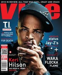
  • Vibe magazine belongs to the RnB/ hip- hop genre
Out of these five magazines, they one that appeals to me the most is We Love Pop.  The main image of the magazine features Liam Payne, a member of popular and current boy band One Direction. Using Liam as the cover image, it straight away has a huge amount of interest for the magazine as many One Direction fans will buy the magazine just because he is on the cover. The colour orange is heavily featured on the magazine cover. Connotations of orange are vibrancy and energy which i feel is defiantly given off through this cover. The typography used is stereotypical for music magazines . This is part of the magazines mode of address as it makes the audience more familiar with the magazine. Other aspects which could be identified as mode of address are the slang used words for some of the cover lines such as "JLS GET TOTES EMOSH." This appeals to the audience as it adds a sense of familiarity as it uses Essex like talk which is very popular and current at the moment due to programmes such as The Only Way Is Essex which are popular with the target audience of 14-16 year olds.

Maslow's hierarchy of needs can be applied to magazines as they promise to fulfil many of our needs particularly the We Love Pop magazine cover above. Maslow believes that people want to feel a sense of belonging and this is seen through the title of the magazine. We Love Pop- the pronoun we suggest that it is not just the editors magazine, it is also the audiences magazine which allows them to feel part of the production of the magazine.

Another way in which Maslows theory can be applied is through the use of the audience wanting to increase their levels of self esteem. Not only is We Love Pop a music magazine, it also features a small segment of fashion. Considering this magazine has a target audience of girls between the ages of 14-16, the use of the fashion segment is used effectively as this age group in particular is known to be interested in fashion and music particularly attractive boybands. The lure seen on the cover of this magazine will appear to the audience as it suggests the possible ways in which they can make themselves look and feel more confident by wearing the "hot party looks" featured in the magazine.